I know everyone loves all the "Mariott" signs, but some of these signs look too old for a park that is maturing especially Triple Play, The Orbit, and Fiddler's Fling. Appearance helps produce a ride that people will go on. It is not everything, but it does help. Yes, we do want to preserve the "Mariott feeling", but it also would be good to update the park as well.
Also, I do have to say that the Viper, SUF, RB, and D Vu signs are my favorite. Viper looks the best to me. Does Revolution even have a sign?
|
||||||||||||||||||
|---|---|---|---|---|---|---|---|---|---|---|---|---|---|---|---|---|---|---|
|
|
The Signs (Have a Favorite?)
39 posts
• Page 1 of 2 • 1, 2
Last edited by Ilovthevu' on July 17th, 2004, 9:51 pm, edited 1 time in total.
"I've been staring at the world, waiting. All the trouble and all the pain we're facing. Too much light to be livin' in the dark. Why waste time? We only got one life. Together we can be the CHANGE. So go and let your heart burn bright"
Yes, Revy does have a sign, to the left of the entrance. And, as you probably know by now, I will always keep the "Marriott feel". If the signs look old, just repaint them (same colors). Remember, we are a park about America's history. Not everything should look brand new. I don't think anyone here wants to become Santa Clara.
The signs look fine to me, I never noticed anything about them looking dated.

I love the traditional feel to much of the signage, and even other things througout the park. It's cool and reminds me that it has been around for a while. Makes me wonder too, what the park was like back then.
To me, signs are signs, I never really look at the signs, but anyways, when I do see them, I like them for their vintage look. They should just leave them the way they are because it looks good.
Universal Orlando Mechanical Engineer
Marathon down, Goofy to go.
The signs fit their respective rides. I don't care if a sign looks flashy or not just keep the originals.
Do any of you guys have a favorite sign? Also, how do you the Mardi Gras signs? The Revolution sign looks a little puny.
You already know my favorite sign, and I like the Mardi Gras especially the RC on the building. Also, I can't remember, but did Whizzer have another sign in front of the line? I remember them putting that up a couple years ago, but I can't recall what they had before. Last edited by Ilovthevu' on July 21st, 2004, 2:45 pm, edited 1 time in total.
"I've been staring at the world, waiting. All the trouble and all the pain we're facing. Too much light to be livin' in the dark. Why waste time? We only got one life. Together we can be the CHANGE. So go and let your heart burn bright"
I don't really have a favorite sign at the moment, maybe RB or RC. I'll decide on that next time I go to the park. I hate SUF's entrance sign, it looks bad. And Revy's is indeed puny. The Mardi Gras signs are very neat.
They've had this same sign for quite a while

My favorite signs are the no line jumping signs.
Mine Too!
My most hated sign is the sign that says, This ride will not open today. My favorite sign is the sign that says, no smoking in the queue lines
Universal Orlando Mechanical Engineer
Marathon down, Goofy to go.
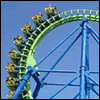
The V2 sign is cool.
Worse sign is probably Gaint Drop. Like they would really name a mine El Diablo Loco ?
What? That's my favorite sign. My friends and I make a tradition of seeing it every time we go to the park! Weird topic, but my favorite sign is Iron Wolf's.
V2 is to techno looking...I love it.
Ehh, the unsymetricalness of it has always bothered me....it would look real nice if it exteded all the way around.
Hmm... Thats a pretty stupid reason to dislike a sign. Around the world and back
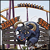
Raging Bull has a nice, cartoony sign that really differs from the logo making it really stand out. The Demon sign (pre-burial), and the Batman sign. I like how it's subtlely engraved into the stone gate rather than colored and in-your-face.
I like vipers sign.
Just because you wouldn't name a mine El Diablo Loco doesn't mean that Six Flags Inc. wouldn't name a mine El Diablo Loco
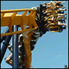
A-ways up the topic here, someone mentioned that Revolution's sign was too small. Now, originally (according to the concept art) there was supposed to be a big logo sign on either side of the motor housing. What happened to it?
Also, on King Chaos, the counterweights were suppoed to have fleur-di-lies on them , with comedy and tragedy masks atteched to the center axle. Especially with the masks, if you look at the paint job, they painted the axle to have them (no confetti in the center). I wonder what happened?

I like the V2 sign. It looks cool and futuristic almost.
The bull on Raging Bull's sign is a nice touch. (Although, I've never seen a purple bull with a nosering before
I like the signs for Superman, Viper, V2, and Condor.
Finally Coaster Season!!
The ride was renamed from Willard's Wizzer to just plain Wizzer after Six Flags bought the park (Willard was a Marriott family name). The wizzer sign was covered during the 2002 season with a sign that reflected the fact that it was the last year for the Wizzer (maybe that is what you are thinking of).
39 posts
• Page 1 of 2 • 1, 2
Return to Six Flags Great America Forum Who is onlineUsers browsing this forum: No registered users and 158 guests
| ||||||||||||||||||||||||||||||||||||||||||||||||||||||||||||||||||||||||||||||