|
||||||||||||||||||
|---|---|---|---|---|---|---|---|---|---|---|---|---|---|---|---|---|---|---|
|
|
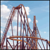
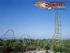
Dark Knight coaster confirmed for SFGAm in 2008
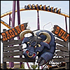
I drove by Six Flags the other day, and dark Knight is HUGE next to Superman. Anyone else think that thay should have lowered it into the ground a little? They do go into a subway on the ride.
13 - GateKeeper
14 - Millennium Force 15 - Enchanted Tales with Belle
On Opening Day before Superman opened, we walked up the exit path to get a good look of TDK. It looks pretty cool inside with the props that are up so far. Although, it seems like the building is much taller the the ride.
Also, we heard from a Op that there was a face chopper that was "scary"...yeah, no such thing. [read]
NOTICE! Look at two pictures and find a differance:
Six Flags Great America: April 18th http://www.sixflags.com/greatAmerica/ri ... hotos.aspx SFGAmworld April 26th http://www.sfgamworld.com/gallery/Openi ... struction2 There is something that went "backwards"... can u guess what's missing... and i'm not talking about the sign. There is something they added and got rid of it... Six Flags Ameirca as the number 1 park at SFI.... this is JOKE!
the spikes on the top of the building

^"going backwards" the spikes were added... not removed.
Is it one of the lights on the right side of the building?

I'd have to agree with the statements saying that the building looks huge. I would have never guessed it would be that big.
WHO IS GOING ON OPENNING DAY OF The Dark Knight Coaster? May 21st, 2008?
I'm Six Flags Ameirca as the number 1 park at SFI.... this is JOKE!
^well i am i might skip school for a hour then go to school
sixflags rocks
Has anyone heard about about on-ride photos for the TDK?
Maybe that why the line goes to the S:UF exit area! Looks like SFGadv maybe getting it! What's the Scoop Party all Night, Sleep all DAY!!!
http://www.sixflags.com/greatAdventure/ ... hotos.aspx if you go there you would see great adventures one its going to be the same ride but they got more pictures than we do check it out
sixflags rocks
Anyone have pics from yesterday and today?
As of today sunday May 4, Track pieces next to drop-off zone are now gone, and most likely placed inside the BOX with the last wall being closed up near the service road side
Party all Night, Sleep all DAY!!!
It's becoming more believeable that it will open when expected, however, I think it depends on how much theming they have left to do, as well as testing.
There was ALOT more themeing inside the box today such as subway walls up the lift hills as well as lots of other work along other parts of the track.
Photos from SFGadv On-ride Photo Booth and Sign for the Big Concrete Blocks. Enjoy
http://www.gainsider.com/gallery/thumbnails.php?album=404&page=1 Party all Night, Sleep all DAY!!!
^There's a good picture of the sign we'll be getting for the ride in there too! It looks really nice, it's almost making the box look worse with the rest of it looking so nice.
RIP: Trailblazer and Deja Vu...heck, even Alien Encounter
Fangs Up Cobra Style!!! Chitown's finest resident here!!!!!
haha opening day is the day my senior trip is!
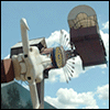
 Great America's on the left, Great Adventure's on the right. I stand by my original opinion that Great Adventure's version looks way more professional. Why do different parks have different designers? Maybe we need to give ours a bit more time, but I think Great Adventure's version really sells the whole "subway station" theme a lot better. Everything's just more detailed, down to the number of windows, the double doors... oh well. I guess all that matters is the ride itself, but now I am worrying that these shortcomings may be evident in the internal theming too.
I think the true anwser of which one looks better will come in a year or two. Will the color scheme be kept up or be allowed to be faded/rundown which would hurt SFGAM more as ours is brighter which could fade more if not kept up properly. I like both entrances, but I think the gloomy/gray look of SFGADV is more like the typical representation you find of Gotham in the comic books.
I think they both look very well done for a SF park, I dont know which outside will better fit the theming of the interior of the ride. If the interior is set to be gloomy/rundown, that might benefit the SFGADV version, I guess we will all get a better impression once the ride is open and we can experience it which im looking forward to do on 05/21 if it opens that day as planned.
I'll take waiting in A/C over waiting in the summer heat for waiting an over a hr. to ride
Party all Night, Sleep all DAY!!!
I suppose I would argue that the SFGAdv version is more equipped to handle the long haul because there's less that has to be maintained. All they've gotta do is hire some window washers, whereas we'll have to bring in the paint crew. And I dunno if I trust Six Flags to maintain something like that over the years, which is why I think it was smarter on SFGAdv's part to use real glass, PLUS I think it looks more Gotham-like, like you said. Ok.. enough.. I don't wanna be a buzzkill, so skip it -- Great America PRIDE!! haha.. May 21st couldn't come soon enough... but I will not rest until I've read a review from someone who's seen internal theming after having ridden both versions
I think that Ours looks better, it fits in better with the park and looks awesome next to superman the other looks kinda Blah to me.

we'll see how much of the ride queue line spills out into the outside area
perhaps... but what about at nighttime, when our painted cloud theming may look a little more fake? Time will tell...
Return to Six Flags Great America Forum Who is onlineUsers browsing this forum: No registered users and 275 guests
| ||||||||||||||||||||||||||||||||||||||||||||||||||||||||||||||||||||||||||||||